

Initial look and feel explorations to achieve a bolder design language fit for a tabloid.
Immersive breaking news.
For critical breaking news, we introduced an immersive mobile state that extends the lead teaser image to the very top edge of the screen. By removing standard UI borders and utilizing the full display, we create an immediate visual impact that signals the urgency of the event.

A PoC prototype was tested with real Blick users to assess the appetite for new features and content formats.
From quick snacking
to sustained engagement
Data showed that most users stopped reading after only 25% of the homepage. To address this "snacking" behavior, we moved discovery paths higher up the page to capture attention before users bounced. By reducing cognitive friction and rewarding readers with diverse content formats throughout the scroll, we aimed to create deeper engagement.

The legacy layout (left) relied on high visual noise and constant urgency, which quickly led to user exhaustion. The redesign (right) introduces intentional rhythm between transient and sustained reading moments.
Making each scroll better.
On mobile we focused on creating downward scrolling momentum. Each module starts with a high-impact "lean-forward" teaser to grab attention, followed by smaller "lean-back" items that are easier to scan. To prevent users from bouncing, we strategically placed interactive widgets like video carousels at transition points to reignite interest.
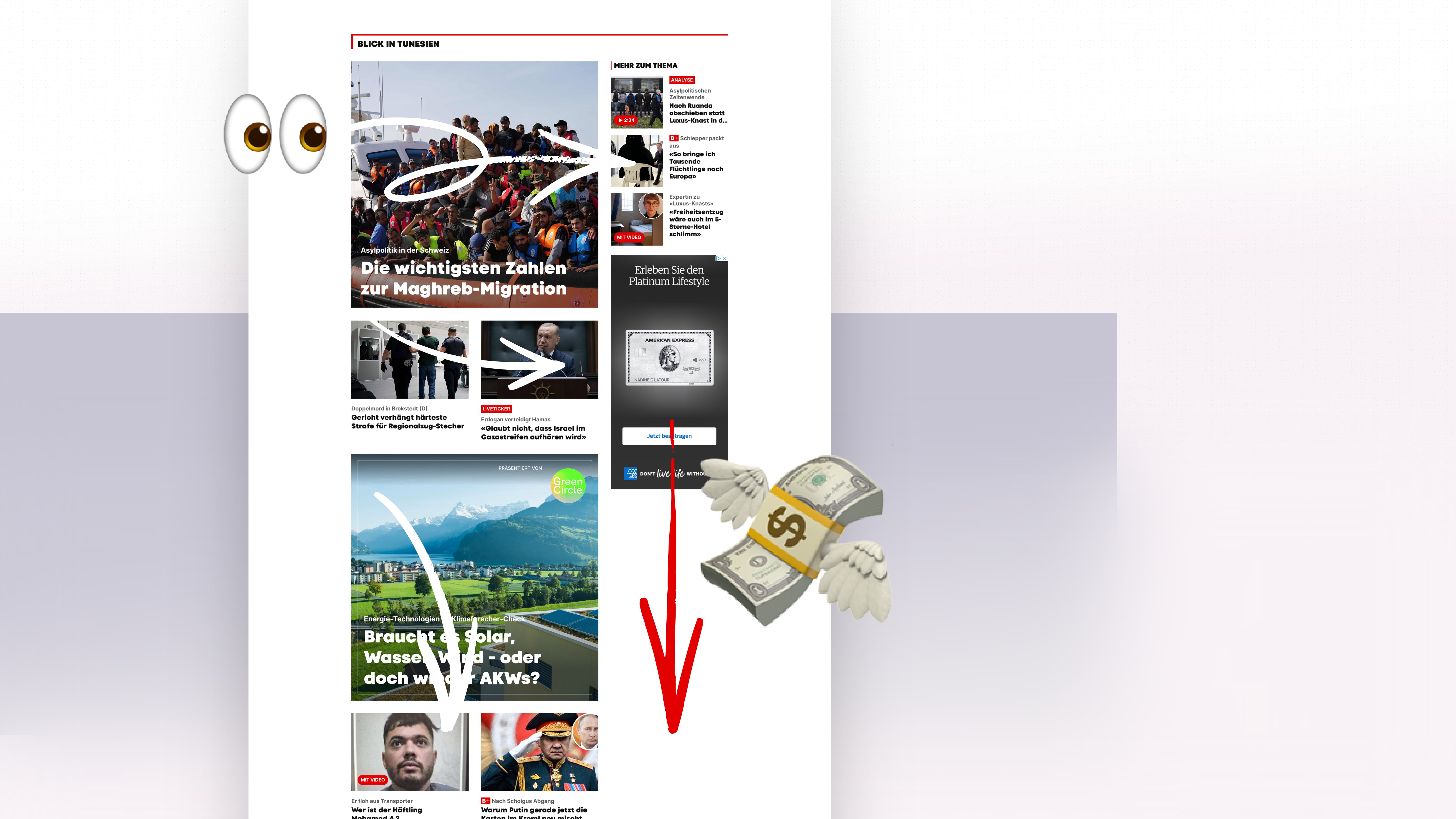
On desktop we used the common F-pattern layout to optimize content hierarchy and increase ad density without compromising readability or the user experience.