Adaptive
Themes
Summary
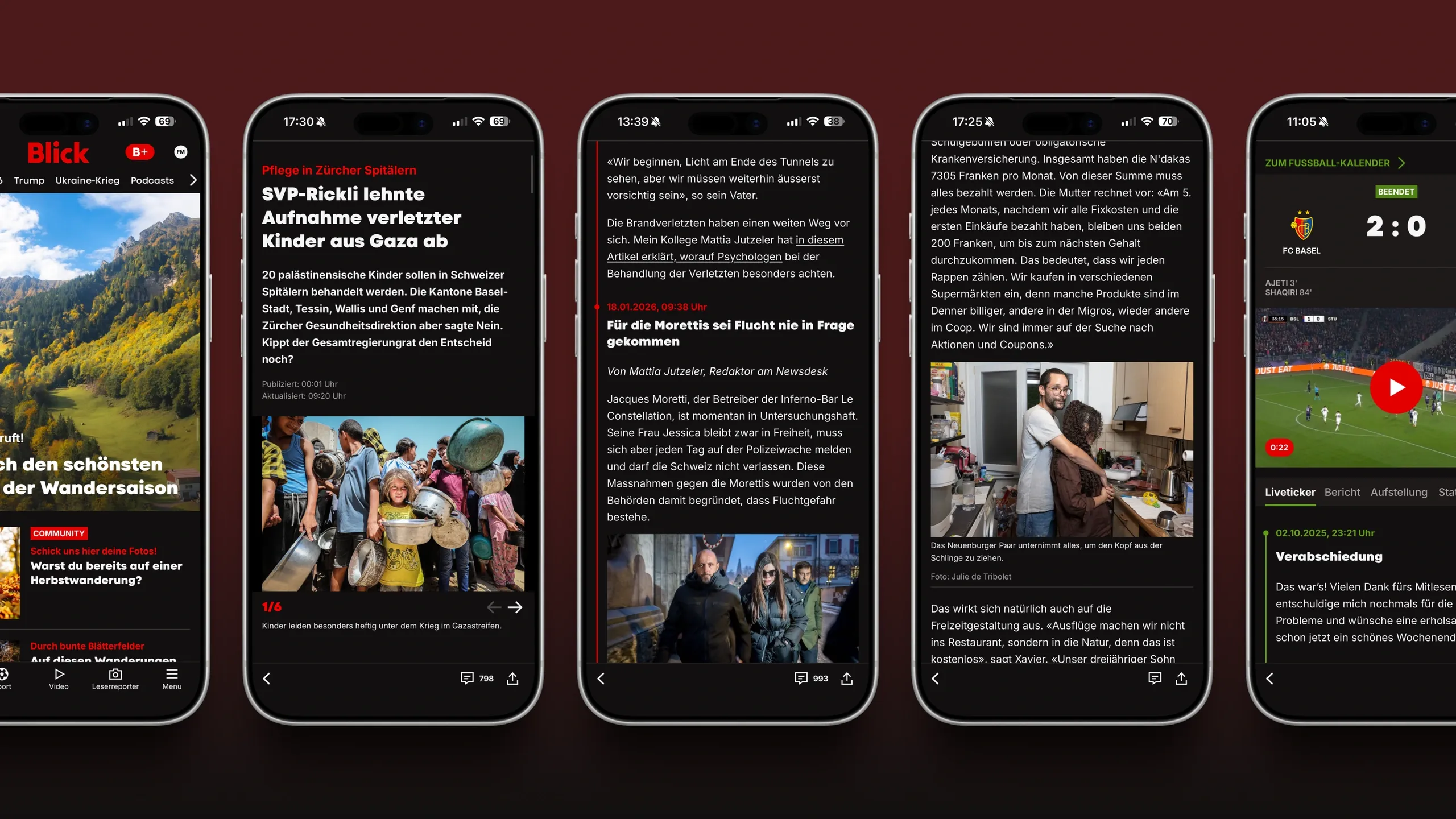
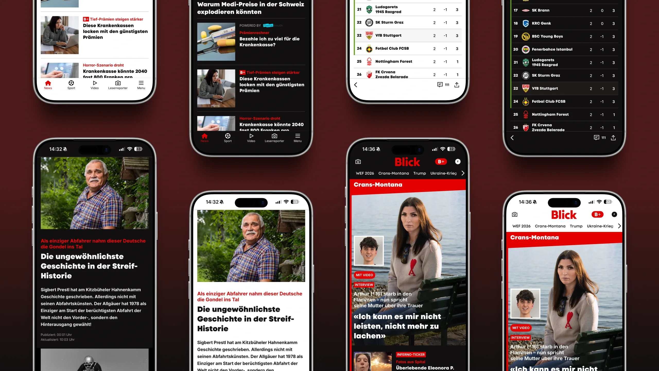
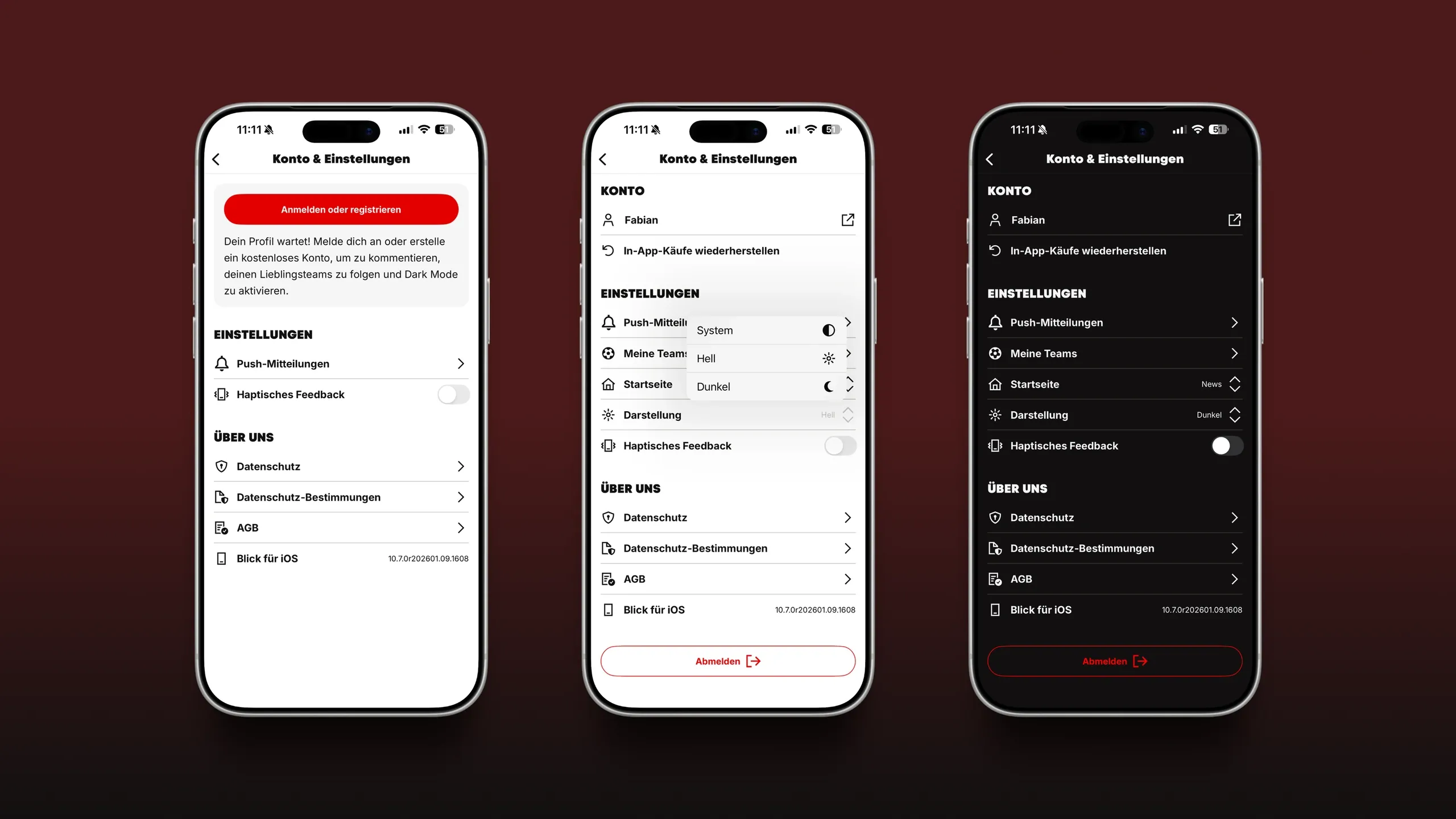
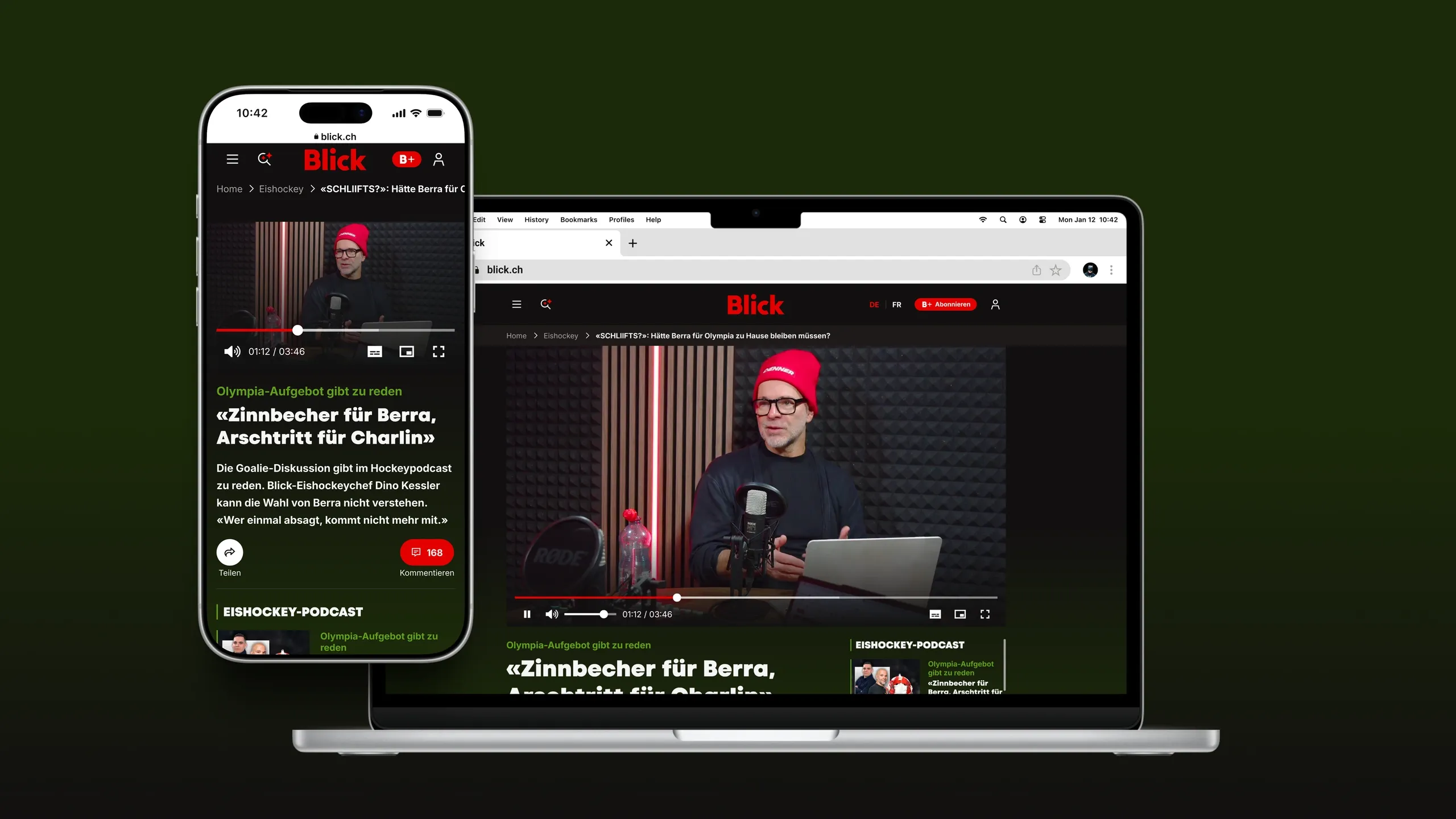
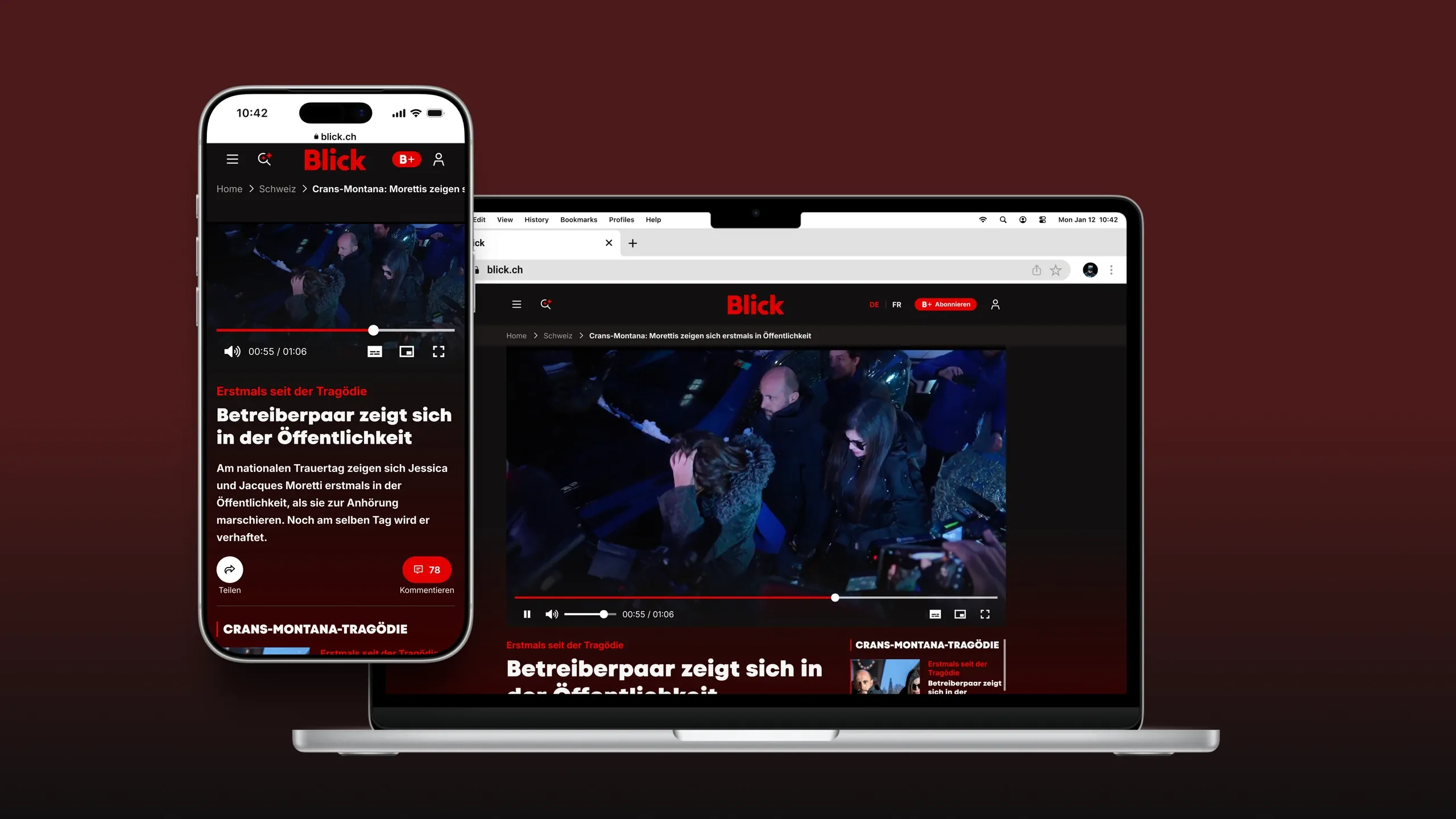
I worked with web, iOS, and Android architects to solve two connected problems: fragmented user settings and the lack of dark mode. We built a cross-platform theme system and a central account hub, making preferences easier to manage while creating a foundation for account growth.
more account registrations driven by gating dark mode behind account creation.
more session time in sessions where dark mode was active.
WCAG AA contrast compliance across the migrated experience.
Challenge
Dark mode had been cut from the 2024 redesign because of time and cost constraints. Its absence frustrated users, who had frequently requested it. More importantly, the existing color system relied on component-level decisions and could not support multiple themes safely across platforms.
Solution
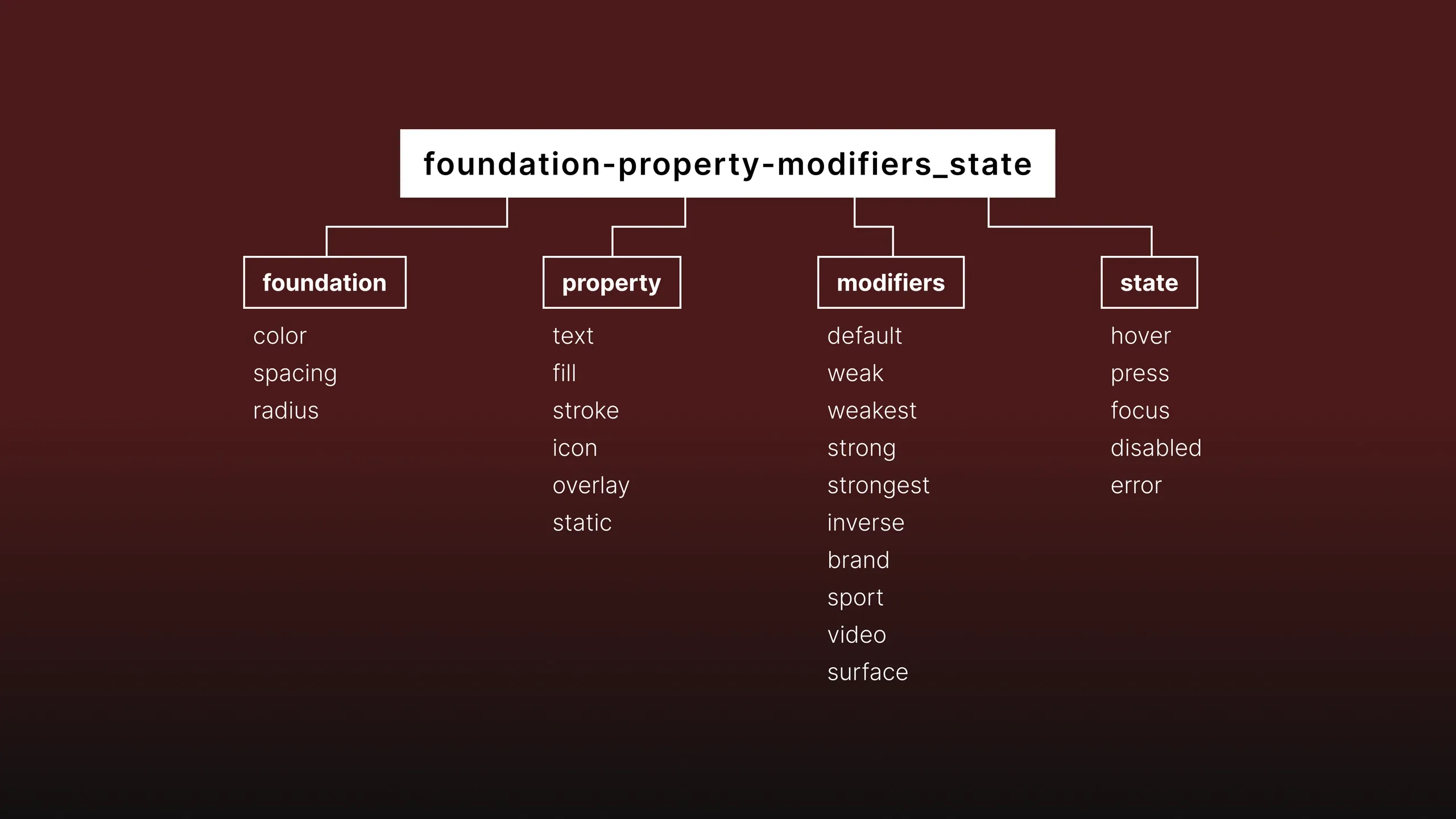
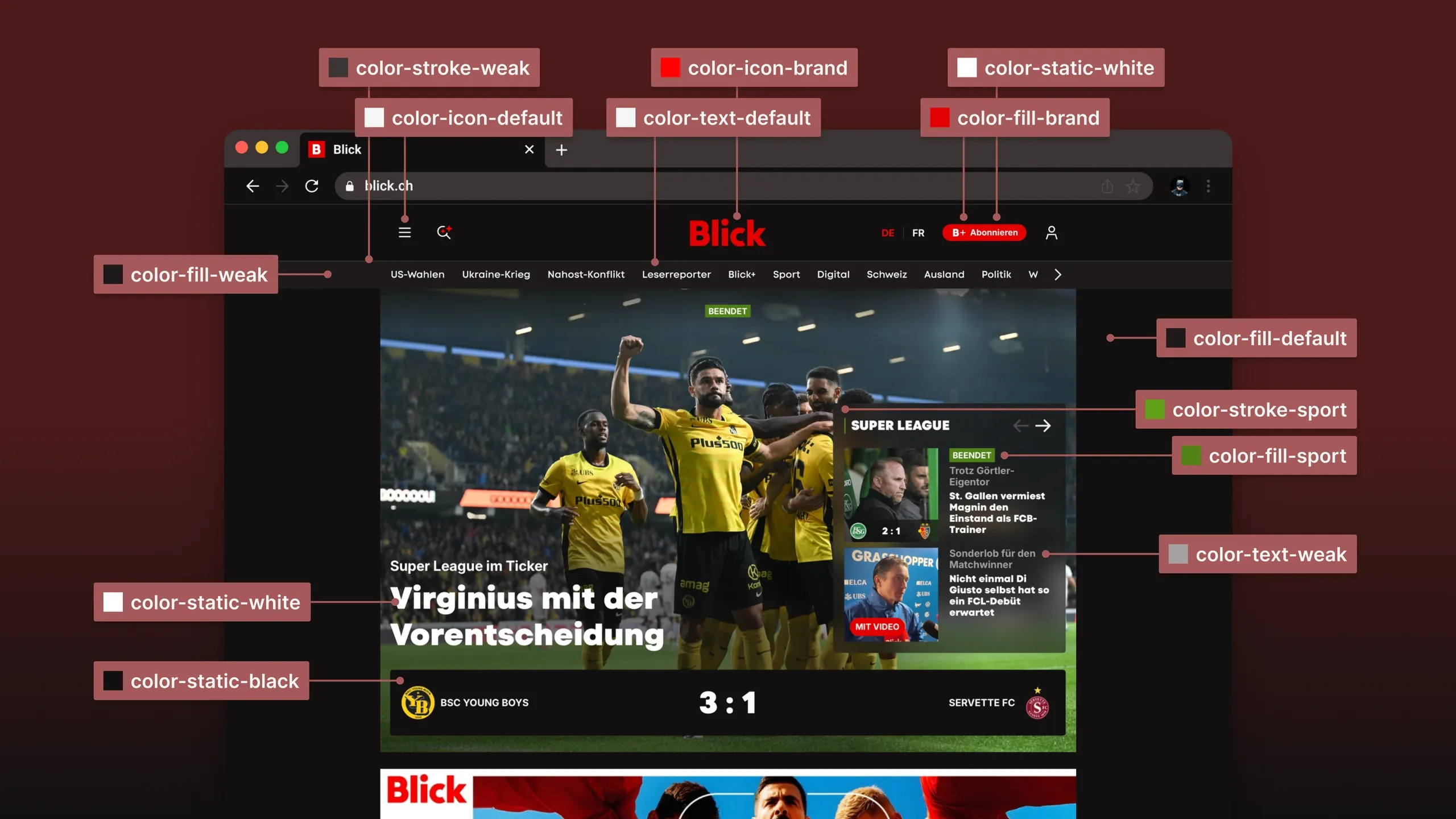
We introduced primitive and semantic color tokens, then migrated more than 600 components across web, iOS, and Android. This created a shared foundation for future themes and brought 85% of the migrated experience into WCAG AA contrast compliance. We also consolidated scattered settings into one account hub. After testing, we placed dark mode behind account creation and measured a 15% lift in registrations.
Bring preferences into one place
Settings had spread across several menus, making controls such as push notifications difficult to find. We brought them into a consistent account hub where users could manage their preferences in one place. The new structure also gave teams room to add newsletter subscriptions, saved articles, and future controls.
Build for more than dark mode
Instead of hard-coding light and dark colors, we separated raw color values from semantic roles such as text, surface, border, and action. This lets teams create themes for video, sports, or premium experiences without rewriting every component. What began as dark mode became a flexible foundation for personalization across products and platforms.
Scale quality through clear guidance
We documented how to choose, apply, and test the new tokens so teams could use the system without constant senior support. Junior designers and apprentices could work independently while meeting the same quality standards. This reduced review overhead and helped the team ship consistent work faster.